The psychology of colour: blue
Each month Martha Roberts, creator of The Colour File investigates how colour makes us think, act and feel. This month, blue

The world adores blue: globally, it is the colour that people love the most. A YouGov survey conducted in 10 countries across four continents found that blue is the most popular across the board. A huge 33 per cent of Brits put blue 8-18 points ahead of any other colour. Even so, whether it’s ‘Feeling blue’, ‘Once in a blue moon’ or ‘Out of the blue’, the colour blue seems to have picked up associations with low mood and uncertainty. So what is the truth about our relationship with blue? Mood-dampener or best friend?
The psychology of blue
The phrase ‘feeling blue’ is thought to date back to when a returning naval ship flew a blue flag and bore a blue stripe on its hull if her captain had died during a voyage. But blue – the colour of enervating summer skies – can also calm and soothe. A study once showed that when medications were red, yellow and orange they were perceived to have a stimulant effect whereas blue tablets were viewed as having a tranquilising effect, regardless of what they actually were. In 2009, a Japanese railway company installed blue lighting on its stations in 2009 and found that it reduced the number of suicide attempts (blue light is known to help re-set the body’s circadian rhythms). And another study found that whilst the colour red helps people with tasks that require attention to detail, blue is better for approach-based, exploratory tasks associated with creativity. Alex Lees, feng shui design consultant and coach says: ‘Blue is typically associated with qualities of calm, peace, clarity and healing, and is often linked with spirituality and the connection to our ‘higher self’.
Blue in feng shui
So is there such a thing as the ‘wrong’ kind of blue? And can using a specific blue influence how you feel or even act? Alex says: ‘If a client tells me they are feeling ‘blue, down or depressed, then feng shui and their use of colour are certainly something I would consider as a subtle influencing factor.’ Sometimes using less blue, more blue or simply a different kind of blue can make the difference between feeling deflated and down or creative and uplifted. ‘A common issue is when a client who loves blue uses it everywhere in their home (and in their clothes and accessories) without restraint,’ says Alex. ‘What would normally be a home with both calming and serene qualities is then transformed into a place that has a draining atmosphere. By selectively removing some blue from their home or wradrobes and introducing other harmonious colours (such as greens or greys) or small pops of ‘Fire’ colour (such as reds, pinks and oranges), balance is restored.’

The power of different blues
‘The shade and tone of blue you choose, how much of it you use and where you use it will make a world of difference,’ says Alex. ‘Certainly the use of dark cold blues in dark cold spaces will create a very heavy, uncomfortable and draining atmosphere.’ However, these dark blues in the right place can be enervating. ‘Feng shui teaches that the shade and tint of blue and where you use it really matters,’ says Alex. So, which blue should go where?
- Dark blue. Whether it’s Royal or Prussian Blue, dark blue has a robust and grounding Qi energy. It relates to security, quality, personal wisdom and serenity. Use it in areas of your home related to money management such as the study, desk or kitchen table where you plan your finances.
- Sky blue. This can be delightfully uplifting, energizing and invigorating but in a lightly fizzy way rather than the more extreme energy kick you’d get from a hot pink.
- Baby blue or powder blue. This has an even softer and gentler energy than sky blue. This is why it’s great for bedrooms and nurseries and it’s very conducive to rest and getting a good night’s sleep.
- Turquoise blue. With a hint of green, this blue combines the ‘growth’ properties of green with the nourishing qualities of blue. As a result, it’s an excellent colour for supporting your personal knowledge and self-cultivation. It is great as an accent colour in home studies offices or spaces where you like to read or meditate.
The colour challenge
Do the ‘Rebalancing Blue Challenge’, which involves making a small design ‘tweak’ and keeping an ‘Energy Diary’ to track the results over the course of 7-10 days. Alex says: “Focus on any one of the following tasks, whichever is the most appealing to you”:
Idea 1
Pick one space or room in your home where would you like to be able to relax more or create a calmer atmosphere. Your design tweak will be to add some mid to light blue accents or accessories here.
Idea 2
Pick one space or room in your home that you associate with study, self-improvement or money management. Your design tweak will be to add some mid to dark blue accents or accessories here.
Idea three
Pick one space or room in your home that is cold, dark or ‘unwelcoming’. Are any cool light blues or heavy dark blues here? If the answer is ‘yes’, your design tweak will be to selectively remove dark blues or tone them down with white accents and accessories. Or you can add some warm neutrals, greys and greens accents or accessories to lift the energy of a cold space.
Your design tweak could involve:
- Changing the colour of a feature wall or fabrics (curtains / cushions / bedding / throws / rugs / towels etc.)
- Changing the colour of accessories such ornaments, pots, plants/flowers and artwork or posters.
Get a notebook and make diary notes 3-5 days before your design change and then 3-5 days after your design change. Each day briefly write down your impressions of how you or others use the room and answer the following questions.
- Is it easy and comfortable to carry out the activity you wish to do in the space?
- What does the atmosphere of the room/space feel like?
- How do you feel (mood and energy levels) in the space?
‘At the end of the exercise you will be able to compare the ‘before’ and ‘after’ results of your blue design change,’ says Alex.
How Martha did the challenge?
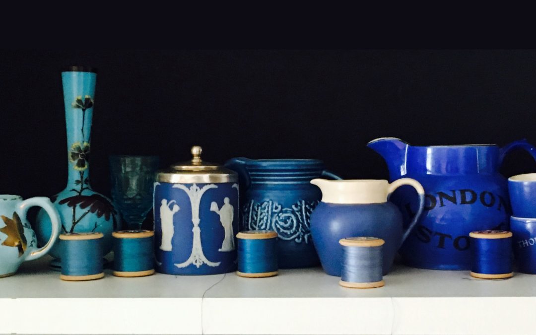
The last time I surrounded myself by blue was when I had ‘smoke blue’ Laura Ashley floral wallpaper in my bedroom at the age of 11. I loved it at first but soon went into the cellar to dig out a can of white emulsion to paint over it. When I took on the blue challenge I thought I didn’t have blue in great quantities in my home to work with – but then I started to spot it. Through all my years of charity shop and car boot hunting, it seems I have been an unwitting collector of blue glass and china, from light through to dark.
Before I did the challenge, I wrote down how I felt in my ‘Energy diary’. The words ‘jangled’, ‘exhausted’ and ‘push-me-pull-you!’ came to mind – as usual I was trying to get 48 hours out of one day and feeling like I was running out of time and energy by midday. Looking at Alex’s three challenge options, I felt that both 1 and 2 were relevant to me: 2 because I was in the middle of writing a book and thinking about new business ideas, and 1 because the need to relax more!
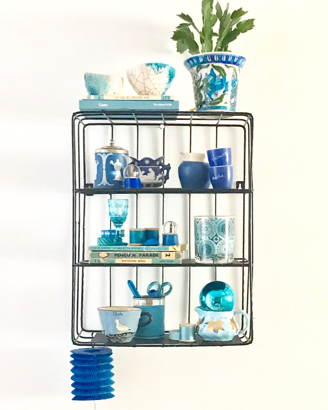
Rather than painting a wall blue or something more permanent, I decided to do a blue ‘shelfie’ incorporating my favourite blue objects on a set of three small shelves. I arranged them so that different types of blues were on each shelf – dark blues at the top and lighter blues and turquoise further down. I hung the shelf on a wall near my dining table which is where I often work but also where I sit and contemplate!
For five days, I made a point of sitting there for 15 minutes so that I could look up at the shelf when I was getting on with writing tasks. Each day I jotted down my observations and how the challenge made me feel.
At first it was hard to sit still and take it in (working from home I’m inclined to interrupt my work with putting on the washing machine!) but as the days went by I found that focusing on the shelf introduced some calm into my day. I even looked forward to sitting down and just drinking the colours in. I’m not sure it made me feel energized but it certainly injected an element of mindfulness into my work, anchoring me to the moment and helping to give me a sense of perspective and calm that I’m not sure I would have otherwise had. I felt like I got a lot out of this blue colour challenge and would recommend it.
Did you know?
- References to ‘the blues’ are thought to come from the use of blue indigo which was used by many West African cultures in death and bereavement ceremonies where the dye would have been used for mourners’ garments to indicate suffering.
- The Elizabethans used the phrase ‘blue devils’ to describe something menacing.
- Author Washington Irving is credited with having first used the term ‘the blues’ in 1807 as a shortened version of the Elizabethan phrase and as a synonym for sadness. ‘He conducted his harangue with a sigh, and I saw he was still under the influence of a whole legion of the blues.’
Find out more about Martha here.
Images: Martha Roberts.


